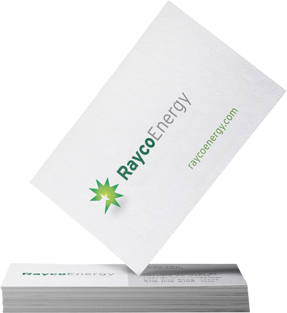
Re-energize your Brand...
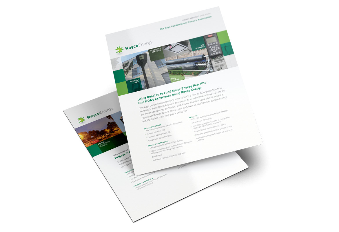
Rayco needed to refresh their brand. Their business model was taking a dramatic shift — from focusing on painting services for home owner’s associations (HOAs) to installing solar and energy-efficient lighting at those same sites. Their current Rayco name was perfect for the new venture, but their old identity did not align with their new growing offerings.
The Challenge
Rayco’s existing logo was old and outdated. Since they were an up and coming leader in the energy and solar market, they needed an updated identity that not only conveyed that they were a trusted and professional brand, but also set them apart in the competitive solar and energy space.
Project Goals
- Build trust through an updated, professional look
- Convey the positive and upbeat experience of working with the Rayco team
- Create a visual identity that portrayed the concept of energy
Wendy is the go-to strategist for local bay area companies looking to expand and renovate their brand. You get big agency results, small agency accessibility and the creative expertise that comes with working with the owner. Her local knowledge also gives her a great advantage in the work she does.
Her strongest trait is being transparent and having flexible, open work flow/communication. We solidly recommend Wendy Wood Design.
Ricky Chu, CEO and Co-Founder,
Rayco Energy
Results: A Brand that Shines
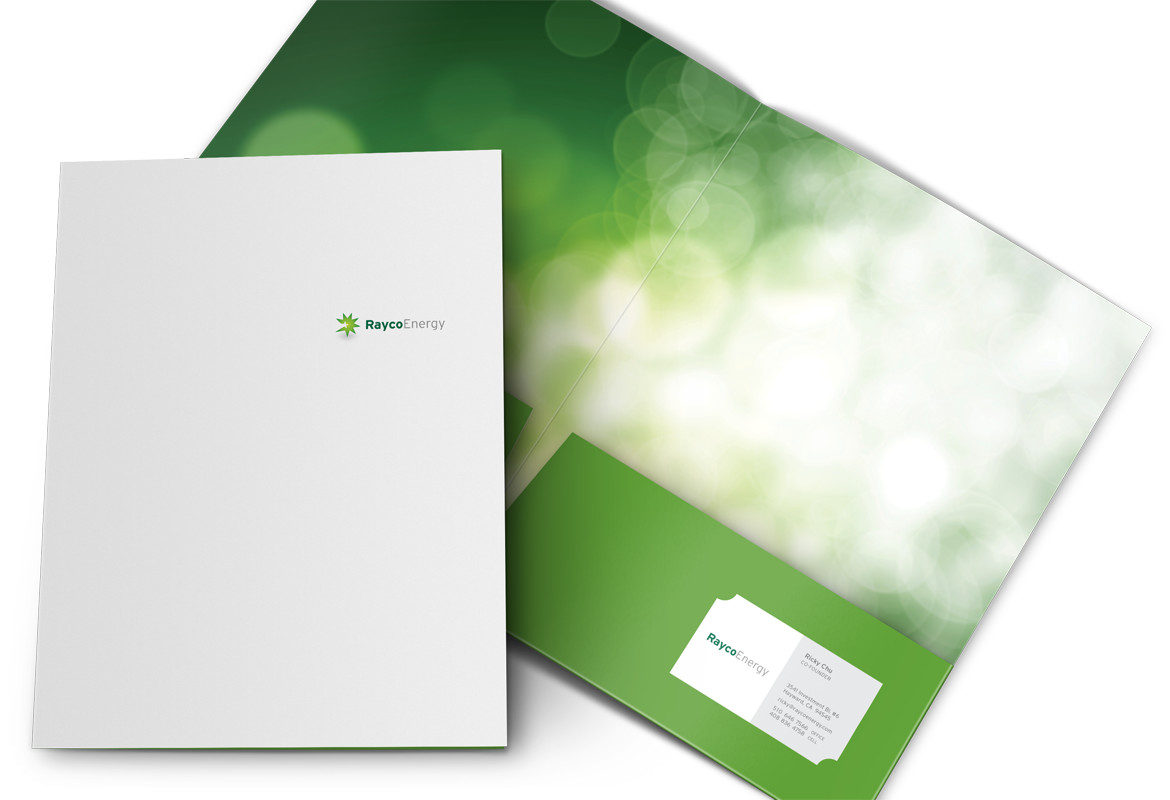
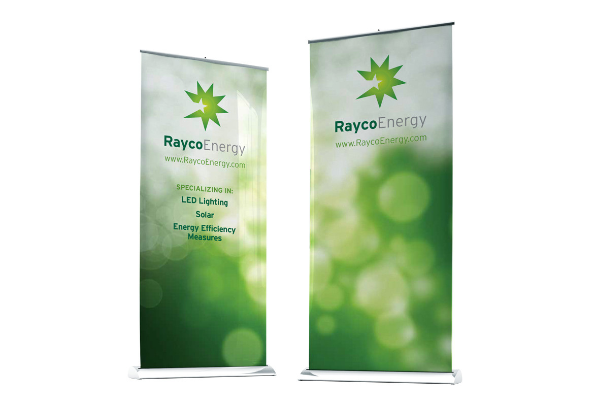
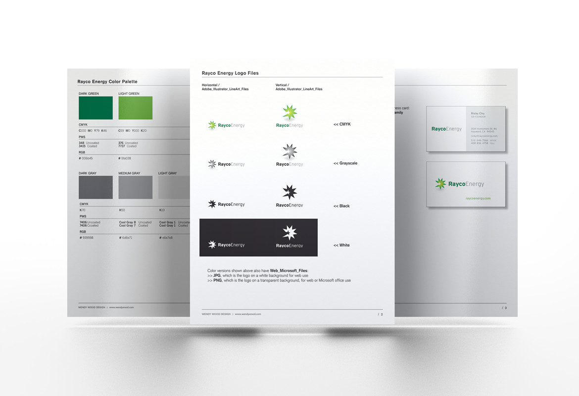
Playing off the ‘Ray’ in Rayco, we developed an identity around the idea of producing energy — creating a burst of energy centered around a star. The thinking being that the star represented quality, light and experience with the Rayco solution radiating from that core set of values and services.
Need big agency strategy with small agency accessibility? Call today.
Schedule a free, no-obligation 30 minute consultation and needs assessment. Spend some time with a creative thinker and get direction on your next project.


